Understanding PainTrek Reports
Take control of your pain journey with powerful visual reports
Understanding the Reports
Chronic pain is incredibly complex. Those who successfully manage it do so by taking control of the health decisions in their life. The pain won't go away on it's own, but you can get better if you own your care. The best way to do this is to understand your pain and help others understand it too.
Imagine going to your doctor or care team with a visual record that shows exactly where you hurt, how much, over time. Add to it symptoms, triggers, and treatments and your journey becomes a powerful tool for making decisions.
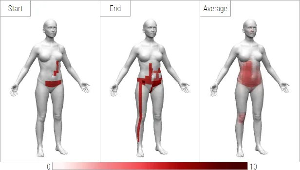
Overview of Body Heatmaps
At the top of the report are 3 images. Note that the model's orientation matches the view inside the app prior to creating the report. These images represent pain for:
- Start - the very first entry for the "start" date.
- End - the very last entry for the selected "end" date.
- Average - a visual averaging of all entries between the start and end dates.
Changes to Pain
Below the images is a high-level view of your progress since the selected START entry. Each section is colored based on the change (Green = Positive Change, Red = Negative Change, Grey = No Change). This can serve as a quick indicator for clinicians on whether a treatment is working or not.
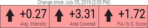
Detailed Stats on Pain
This sections shows pain statistics for the selected dates and region. This is great for getting a better idea of how your pain has changed and what exactly changed. Numbers are accurate to +/- 0.005. "Average Intensity" represents a range of [0,10]. While "Area" and "P.A.I.N.S." are percentages. The change represents the difference between start & end values. Averages take into account every pain entry within the selected date range.
Average Intensity
This is the average pain intensity for all cells you painted for the selected region. (head, trunk, etc.) It is similar to the scale of 0-10 just represented as a percentage. So, 20% is similar to 2 on the traditional scale. Since we capture multiple intensity values over the body this allows you to see generally what level your pain is at.
Area Covered
This is how much of the selected region is covered by painted pain cells. This number is represented as a percentage with 100% being the same as the entire region covered by pain.
P.A.I.N.S.
This is a new measure we created that combines both the pain area and intensity to get to a new number. The cool thing about this is that the number has been shown to correlate with brain activity related to pain. (i.e. the higher the PAINS score the more your brain is trying to create opioids to combat the pain) So, it serves as a good general measure of your pain level. An increase in the number means the severity of the pain has increased. A score of 100% is equal to an entire region completely covered with the highest severity of pain. (i.e. a 10 over the whole area)
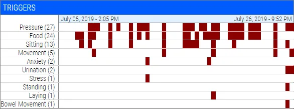
Pain Triggers
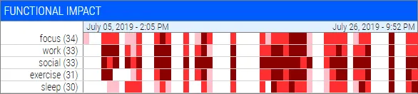
Recorded Triggers for pain are visualized using a heatmap. Each red block represents a pain entry where that trigger was included, white where it was not recorded. Triggers are sorted from highest to lowest frequency.
The heatmap lines up with the graph above and can be used to figure out relationships between pain intensity/area and specific triggers. The first entry is on the left and the last entry is on the right.
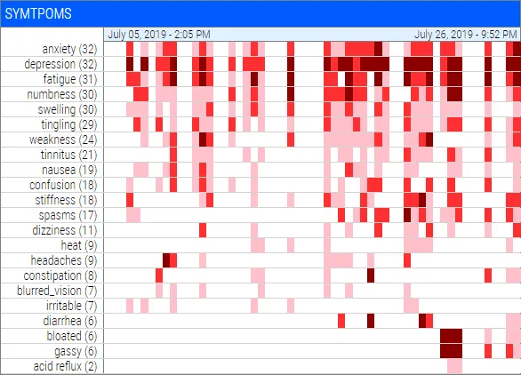
Pain Symptoms
Next are Symptoms, which includes things like "nausea", "fatigue", or "weakness". This section is structured the same as Triggers above, but captures the severity as well.
- White - No effect or not recorded
- Pink - Mild
- Red - Moderate
- Dark Red - Severe
Functional Impact
Below that is the Functional Impact of pain. This includes how much pain is interfering with a patient's function. Does it disrupt their sleep? Does it prevent them from exercising?
This is structured the same as Symptoms above.